Main Content
What Colors Do Tassels Come In?
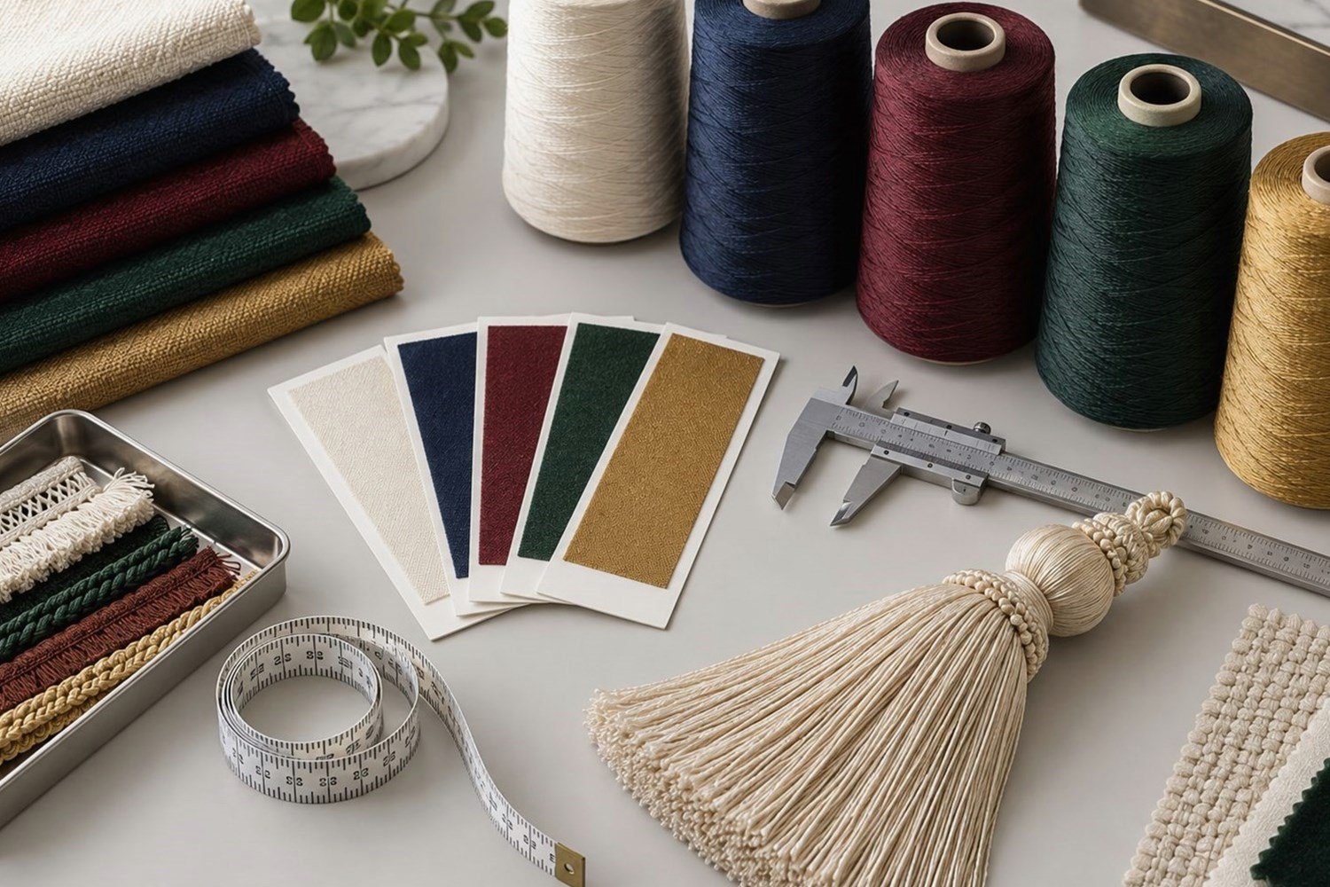
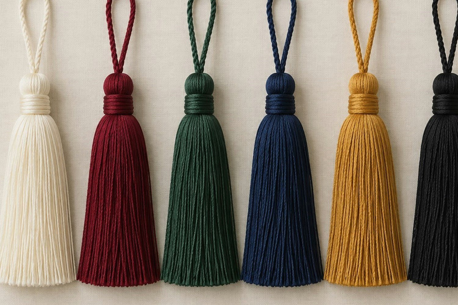
Tassels can be produced in a broad range of color families, subject to the selected material, yarn direction, construction, and customization requirements. Instead of treating every shade as a separate category, buyers can begin with a practical color family and then narrow the specification using references and samples.
Useful color families
- Neutral: black, white, gray, beige, cream, brown, and related shades.
- Warm: red, burgundy, orange, yellow, gold, and warm brown directions.
- Cool: blue, navy, green, teal, purple, and related shades.
- Soft and pastel: light blue, pink, lavender, mint, soft yellow, and muted shades.
- Metallic effects: gold, silver, bronze, or mixed metallic-textile directions.
| Color Family | Example Directions | Common Visual Character | Possible Applications |
|---|---|---|---|
| Neutral | Black, white, beige, gray | Adaptable and restrained | Interiors, books, gifts |
| Warm | Red, burgundy, gold | Rich or energetic | Decorative and ceremonial products |
| Cool | Blue, green, purple | Calm or formal | Collections, accessories, regalia |
| Pastel | Mint, lavender, pale pink | Soft and light | Gifts, stationery, textiles |
| Metallic | Gold, silver, bronze | Reflective accent | Graduation and decoration |
These are useful visual directions, not a fixed factory color chart. Exact shade availability depends on the chosen material and finished product specification.
How Are Tassel Colors Selected?
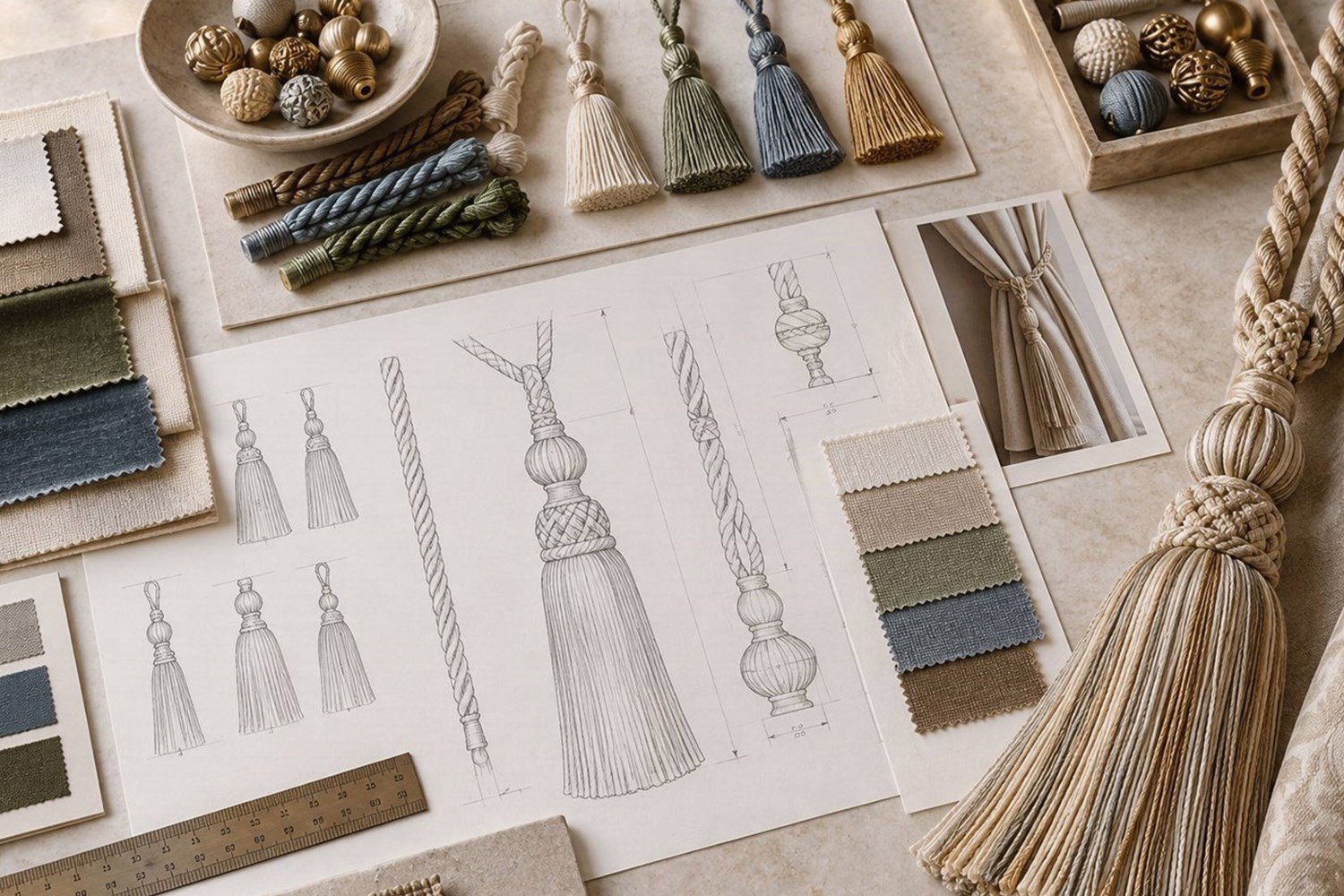
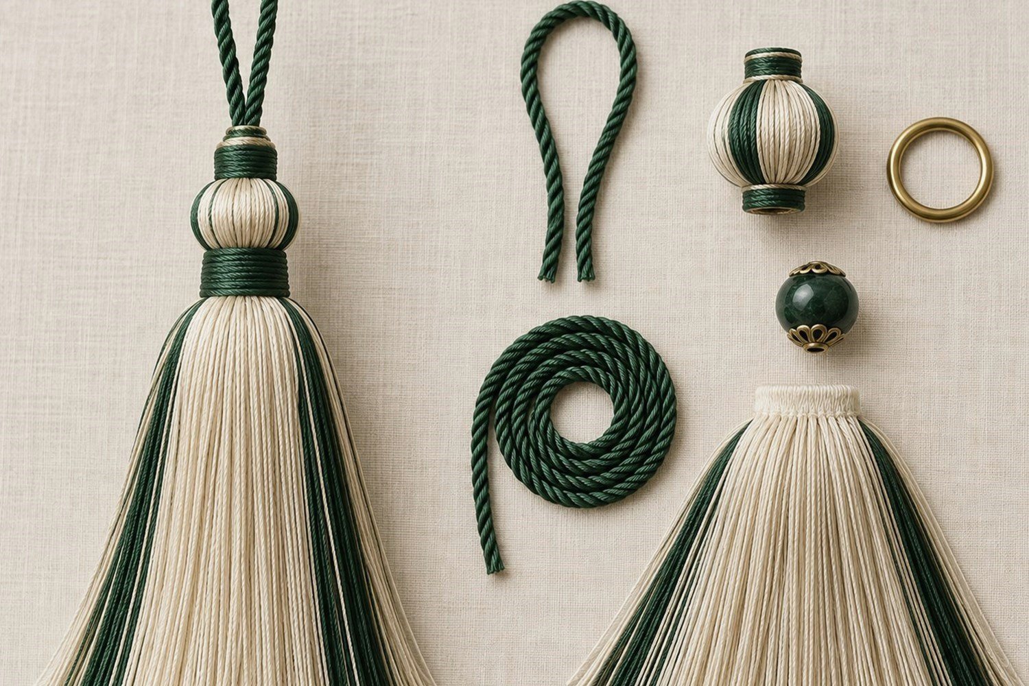
Select tassel colors according to the end product first, then decide whether the tassel should match, coordinate with, or contrast against surrounding colors. This sequence keeps visual decisions connected to the actual use rather than to a color name viewed alone.
- Identify the application and the existing product colors.
- Choose whether the tassel should blend in, coordinate, or stand out.
- Select the material and desired surface finish.
- Define the color family and then the exact shade direction.
- Choose single-color, two-color, or multi-color construction.
- Provide a physical reference, color card, reference product, or image when available.
- Review the color on the actual tassel material and confirm a representative sample when needed.
Color selection questions
- What product will use the tassel, and what colors already appear on it?
- Should the tassel blend in or create a visible decorative accent?
- Is the material matte, lustrous, metallic, smooth, or textured?
- Is a specific shade required, and is a physical reference available?
- Does the design need several colors or coordination across a collection?
See How to Choose Tassels for the wider application and construction process.
Single-Color, Two-Color, and Multi-Color Tassels
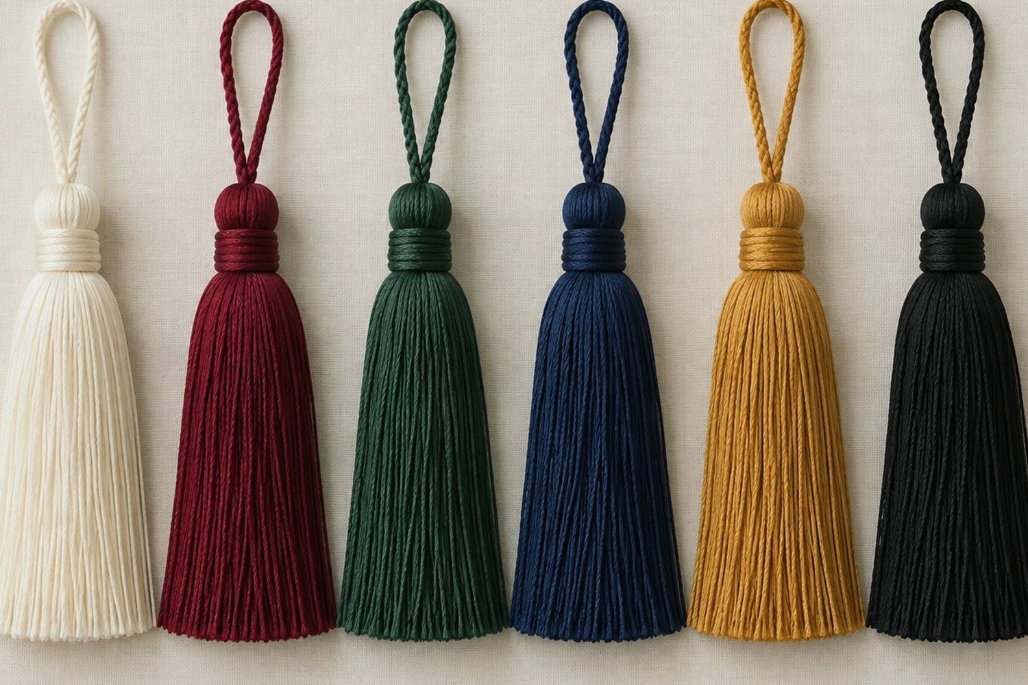
A single-color tassel uses one dominant visible color, while two-color and multi-color tassels distribute colors across strands, sections, cords, heads, or decorative components. The color count alone does not describe the finished design; placement, ratio, and material still matter.
Single-color tassels
One dominant color can provide simple visual identity, easier coordination, a clear brand or school color, and consistency across a collection. A single-color textile body may still use a bead, charm, hardware, or separate attachment in another material or color.
Two-color tassels
Two-color designs can use mixed strands, split sections, one color in the skirt and another in the cord, a twisted two-color cord, or a contrasting component. A color ratio and the exact placement should be stated so “blue and white” does not leave the visual distribution open to interpretation.

| Two-Color Method | Visual Effect | Important Specification |
|---|---|---|
| Mixed strands | Integrated color appearance | Color ratio |
| Split sections | Clear separation | Position of each section |
| Two-color cord | Twisted or braided detail | Cord construction |
| Main plus accent | Dominant and secondary color | Accent location |
Multi-color tassels
Multi-color tassels use three or more visible colors and can support school colors, brand collections, seasonal products, gifts, and decorative accessories. A useful conceptual brief could state: Color A for the main skirt, Color B for secondary strands, and Color C for a cord accent. This is a design description, not a fixed construction.
How Do You Match Tassel Colors to a Product?
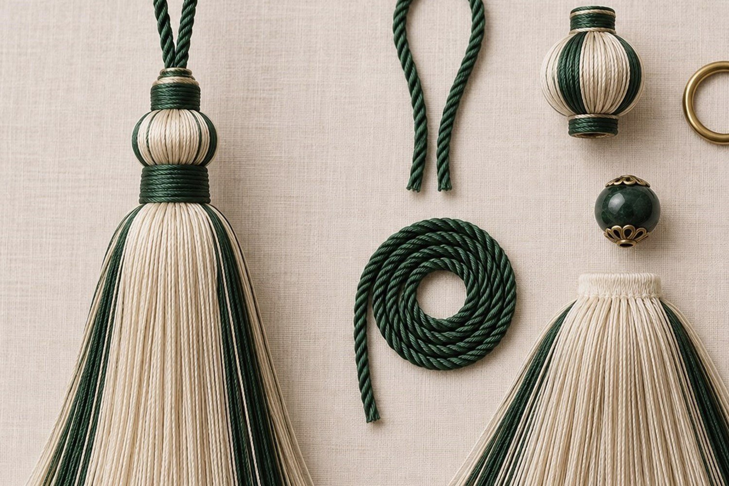
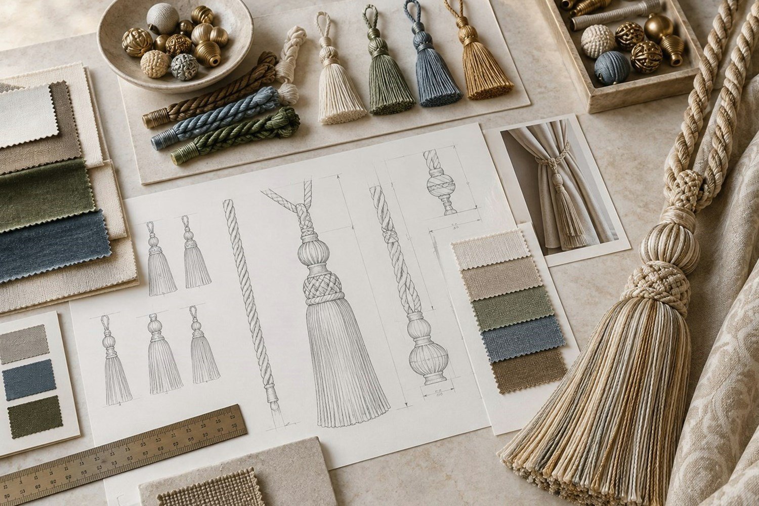
Match a tassel by first using the product or fabric as the main reference, then choose whether the tassel should be similar, related, or visibly different. Matching gives continuity, coordinating creates a controlled difference, and contrast makes the tassel a more prominent decorative element.
| Color Strategy | Visual Result | Possible Application |
|---|---|---|
| Matching | Integrated appearance | Curtains, cushions, branded products |
| Coordinating | Balanced distinction | Home textiles, gifts, accessories |
| Contrasting | Prominent decorative detail | Packaging, fashion, decoration |
Fabric and home-textile matching
For curtains, cushions, upholstery, bedding, or other textiles, use the fabric as the primary color reference. Identify dominant and accent colors, select the tassel material, compare physical samples where possible, review under relevant lighting, and then confirm the finished sample. Fabric texture and tassel sheen can make nominally similar shades look different.
Brand-color matching
Brand, school, event, or packaging colors can guide a design, but a digital RGB or HEX value shown on a screen does not automatically reproduce identically on textile yarn. A physical swatch, existing product, or recognized color reference is more useful when close coordination matters. Screen images remain helpful for initial communication but should not become the only physical color target.
How Do Material and Sheen Affect Tassel Color?
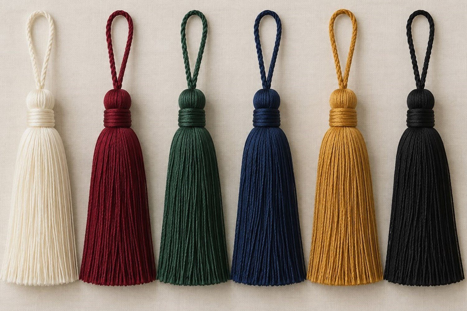
The same nominal color can look different on different tassel materials because fibers vary in surface texture, sheen, light reflection, and dye appearance. Material does not make one color universally better; it changes the way a selected shade is perceived in the finished tassel.
| Material | Typical Surface Character | Possible Effect on Color Appearance |
|---|---|---|
| Polyester | Varies by yarn and finish | Can range from matte to more lustrous |
| Rayon or viscose | Smooth and often lustrous | Can appear richer or more reflective |
| Cotton | Soft and generally matte | Can appear less reflective |
| Silk | Natural luster | Can change subtly with light |
| Metallic yarn | Highly reflective | Creates metallic visual effects |
| Textured yarn | Fuller or uneven surface | Changes shadow and visual depth |
A dark blue matte cotton tassel may look different from a dark blue lustrous rayon tassel even when both are described as “dark blue.” Compare matte, soft-luster, high-luster, and metallic surfaces on the selected material. See Tassel Materials for the related material overview.
Can Tassels Be Matched to a Color Reference?

A physical or recognized color reference can communicate a target color direction, but the final textile appearance should still be reviewed on the actual yarn or finished tassel. A reference does not remove the influence of fiber, yarn structure, surface sheen, lighting, and construction.
| Level | Example | Why It Matters |
|---|---|---|
| General family | Blue | Sets an initial direction |
| Shade direction | Navy blue | Narrows the target |
| Reference | Approved swatch or recognized color reference | Improves communication |
| Material confirmation | Rayon, polyester, cotton | Checks actual appearance |
| Finished sample | Complete tassel | Confirms the combined result |
A Pantone reference, where supplied by a buyer, can be one communication tool for a target shade. Printed or coated references and textile yarn are different media, so they should not be expected to look visually identical in every light or on every fiber. A physical yarn or finished tassel sample is the stronger reference when close matching is important.
Why photos can look different
Lighting, white balance, camera settings, screen calibration, display brightness, material sheen, viewing angle, and background color can change perceived color. Use digital images for initial discussions; use a physical swatch for closer comparison; and use the finished sample to assess the complete tassel.
What Do Graduation Tassel Colors Mean?

In academic regalia, tassel colors may represent a field of study, degree, college, institutional tradition, or university identity, depending on the institution. Commonly seen U.S. academic associations include white for arts and letters, light blue for education, orange for engineering, brown for fine arts, crimson for journalism, purple for law, green for medicine, pink for music, apricot for nursing, dark blue for philosophy, and golden yellow for science.
These are general academic-regalia references, not a universal ordering rule. Institutions may apply their own system: discipline colors, college colors, degree-level distinctions, university colors, or school-specific ceremonial requirements. Always confirm the current commencement guidance before selecting a Graduation Tassel.
| Possible Institutional System | What Color May Represent |
|---|---|
| Academic discipline | Field of study |
| College or school | Degree-granting unit |
| Degree level | Bachelor’s, master’s, or doctoral distinction |
| University identity | Institutional colors |
| Ceremonial requirement | School-specific tradition |
Do not select graduation color solely from a generic online chart. Confirm the institution, degree level, college or program, official guidance, any charm requirement, and whether a single- or multi-color design is required.
Color Directions by Tassel Application
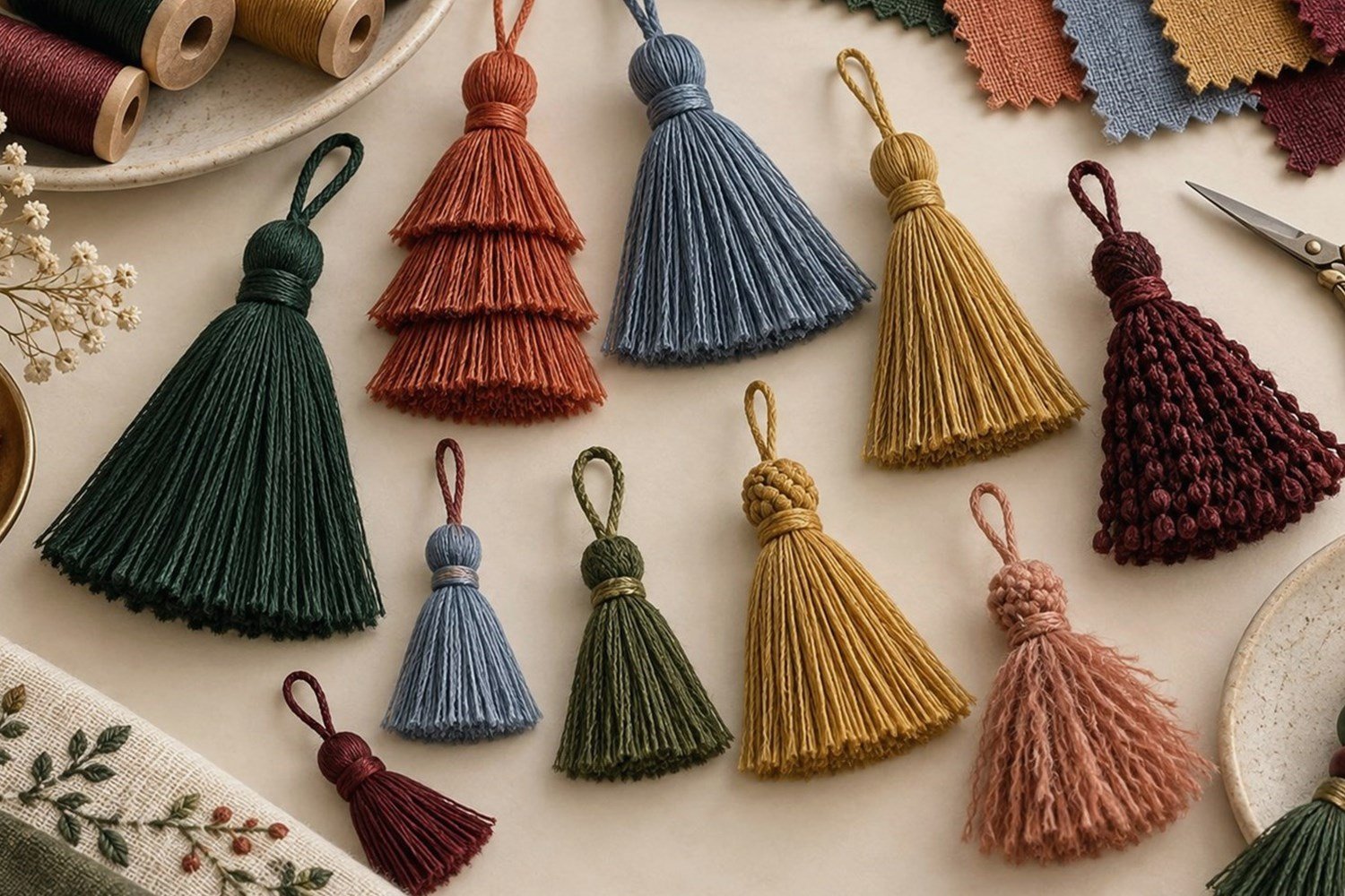
Color selection changes with the end application because different products have different surrounding materials, visual scales, and coordination needs. The same color may work well for one use and need a different material, sheen, or distribution for another.
| Application | Color Considerations | Related Category |
|---|---|---|
| Bookmarks | Cover color, printed graphics, cord, size, and gift direction | Bookmark Tassels |
| Keys and accessories | Furniture finish, interior textiles, metallic accents, contrast | Key Tassels |
| Decorative tassels | Product scale, textile texture, components, collection colors | Decorative Tassels |
| Beaded styles | Skirt, head, bead, charm, and metallic color relationship | Beaded Tassels |
| Curtains and home textiles | Fabric, pattern, room palette, cord, head, and skirt colors | Curtain Tiebacks |
Metallic color directions
Gold, silver, bronze, and mixed metallic-textile effects are influenced by yarn construction, reflectivity, lighting, viewing angle, and the adjacent textile colors. Do not assume all gold tassels are the same shade. Metallic directions can be useful for regalia, gifts, fashion, and decorative products when their visual relationship to the rest of the design is defined.
Common Tassel Color Mistakes
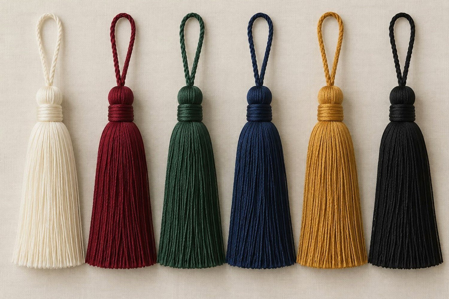
Color problems usually arise when a basic color name is treated as a complete specification. A clear process considers the material, sheen, color distribution, physical reference, surrounding product, and complete finished sample.
| Color Mistake | Possible Problem | Better Approach |
|---|---|---|
| Only “blue” | Many shade interpretations | Define shade and reference |
| Color before material | Unexpected surface appearance | Select material and sheen first |
| Screen-only match | Display variation | Use a physical reference when needed |
| Sheen is ignored | Matte and lustrous differ | Review on actual yarn |
| Multi-color ratio omitted | Unclear distribution | List position and proportion |
| Graduation chart assumed universal | Wrong institutional color | Follow current official guidance |
| Complete tassel unreviewed | Components change the result | Approve a representative sample |
What Should B2B Buyers Specify for Custom Tassel Colors?

For custom B2B sourcing, provide more than a general color name whenever color consistency and product coordination are important. The brief should identify the application, material, exact shade direction, component colors, reference materials, and single- or multi-color distribution.
| Component | Required Color | Reference | Material | Notes |
|---|---|---|---|---|
| Cord | ||||
| Head | ||||
| Skirt | ||||
| Beads | ||||
| Decorative components |
Minimum information for an initial color inquiry
- End application, tassel type, required color, and material or desired appearance.
- Physical yarn sample, existing tassel, fabric swatch, product sample, color card, or reference image when available.
- Single-color, two-color, or multi-color requirement, with color ratio and position if relevant.
- Cord, head, skirt, bead, charm, and metallic-accent colors where relevant.
- Estimated quantity as project context, plus an approved or representative sample for confirmation.
Do not assume every color exists in every material or construction. A documented brief helps make the required result clearer without promising exact visual reproduction under every condition. See Custom Tassels when preparing a custom project.
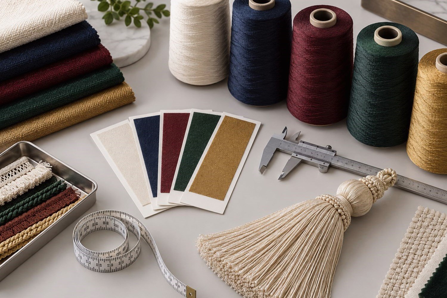
Confirm color before bulk production
Color confirmation should evaluate the finished tassel, not only an isolated digital image. Confirm the material, main and secondary colors, cord, head, skirt, bead or decorative colors, color distribution, physical reference where required, representative sample, and final recorded specification. Reasonable visual variation can depend on material and manufacturing conditions; avoid inventing numerical color tolerances in a general product brief.